Report
Introduction
Problem Description
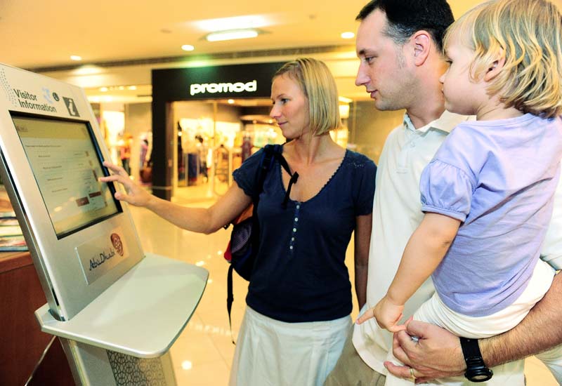
Over the years we have seen a growth in the number of malls in our cities. These have not only grown in numbers but in size too. While children might consider the maze like structure of malls to be fun and adventurous, the older generation tends to want to get to places as quick as possible using the shortest route. The last thing a person wants is to get lost in a mall. Many malls provide interactive information kiosks that help people get to their destinations. Though they are meant to help, they sometimes make matters worse and frustrate those who use them. Many people find them confusing and hard to follow. Some people have likened them to a geography examination. It is usually better to ask security guards for directions . When people give directions they provide key information and leave out unnecessary details. Most mall map visualizations do not give directions in this way. Most times they show a lot of information while important queries remain unanswered.
The aim of our project was to create a better visualisation for mall maps that will make them easier to use and answer relevant queries. This was to be done by taking what a person would use to give directions and implementing that as a visualisation. For example, when the guards give directions they only tell people which landmarks to look out for and which direction to take from them, leaving out a lot of unecessary information.
Input/Output
In our design we assume that people are able and have already entered their choice of destination into the system. The most important output is the directions to the place which are best suited for. Their choice could be entered using a keypad or clicking on icons to avoid spelling errors and save time. The interactive mall map should give the best directions possible but also give users the option to find other routes to take. For example, a person in a wheel chair will want to take the elevator route instead of an escalator route.
Profile of type of user
Malls cater to many different people. For our design we divided our target users into 3 different groups being teenagers, parents/adults and senior citizens.
Teenagers
Most teenagers can be found hanging out in malls. They are usually very technologically savy and highly energetic. Most can find their way around a mall without a map and some prefer to stick to normal hangout spots. They could possibly use the information kiosk to look for particular banks or perhaps new hangout spots.
Adults/Parents
For our design we considered parents as those that go to the mall with their children. Parents with toddlers need to know where changing rooms are and would want to know what routes are stroller friendly. They would need to avoid getting lost in a mall because it would be stressful for both them and their children.
Adults use information kiosks at a mall to find key places such as bathrooms, restaurants and banks. This group of users is relatively comfortable with computer based systems.
Senior citizens
The senior citizens are people aged 60+. They aren't always familiar with interactive systems. They might possibly use the information kiosk to avoid getting lost. Most senior citizens don't enjoy walking long distances. They also don't usually enjoy dealing with complicated systems. They would need the interactive mall system and map to be very clear and intuitive, give them shorter routes (possibly without escalators).
Our assumption is that these users are literate and have used some computer technology before. The users also need to have some ability reading a map. They don't however need to be geography experts in order to get information from the visualization. We aim to have a mall map visualisation that caters to the queries that these users would have.
Related Work
In order to gain an understanding of the existing solutions Information terminals, mall maps and paper maps were studied. In particular Claremont and the V&A of Cape town were considered
Existing Systems
Cavendish Mall - Claremont
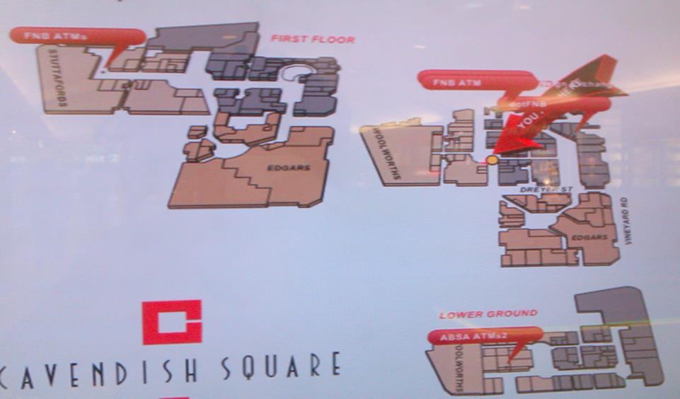
The screenshot displays the existing interactive system at a Claremont information terminal. It is immediately apparent why such a visualization is difficult to use:
- The three floor layout is not clear, with more screen space dedicated to the Cavendish logo than the actual visualization!
- The large red You are here arrow is very distracting
- There are instances of obscuring with the speech bubbles
- Complicated inter floor animations
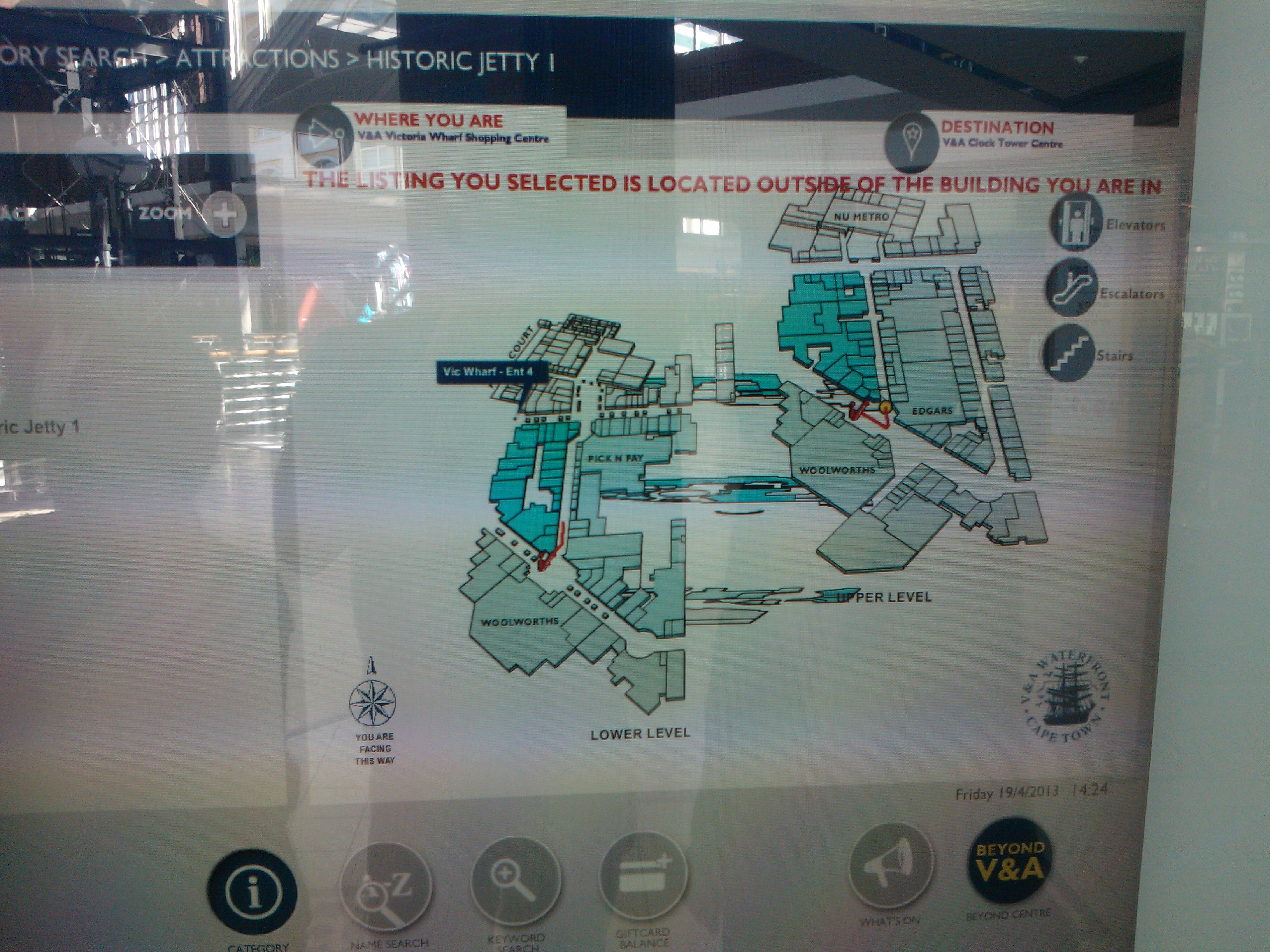
V & A
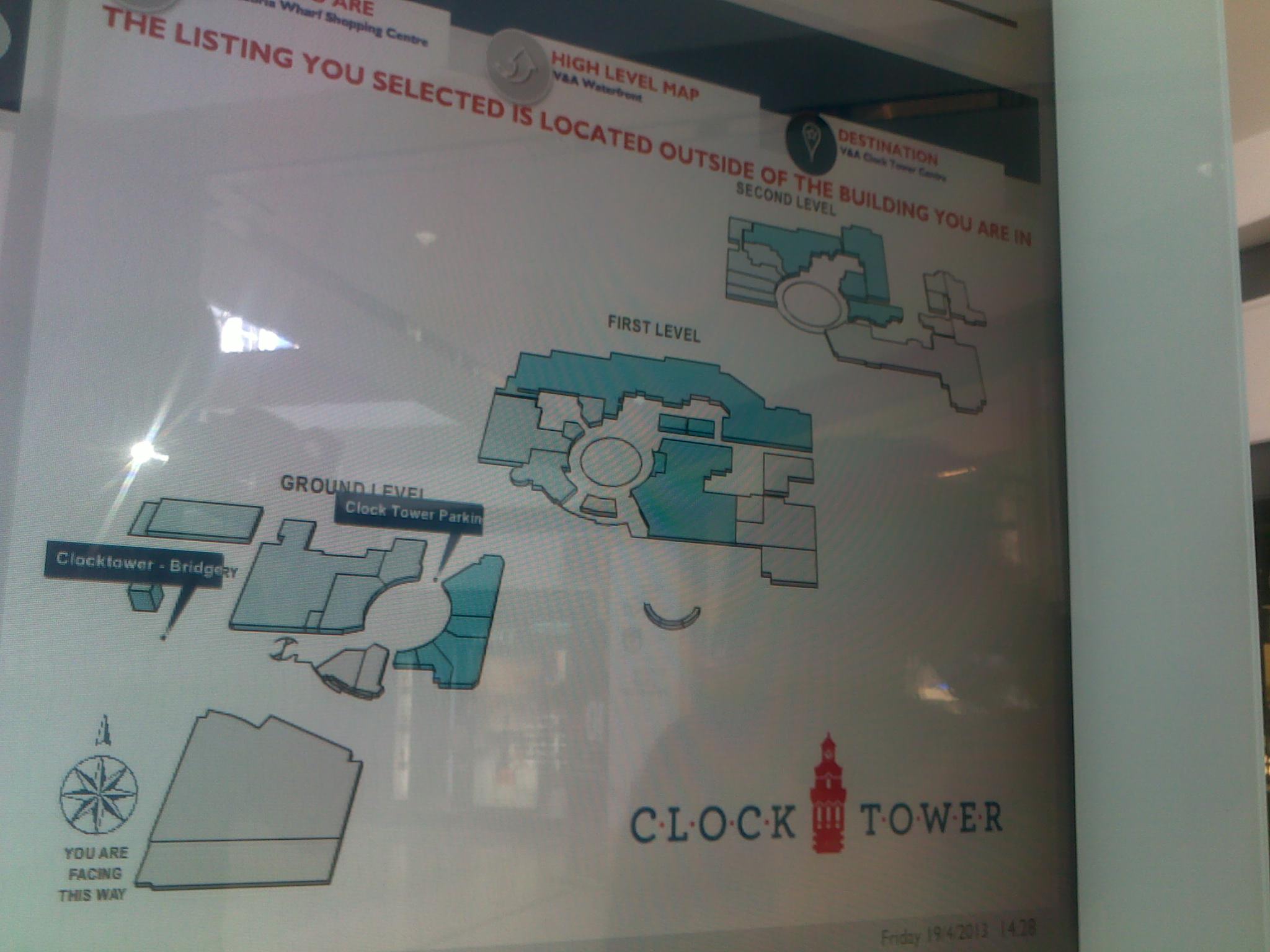
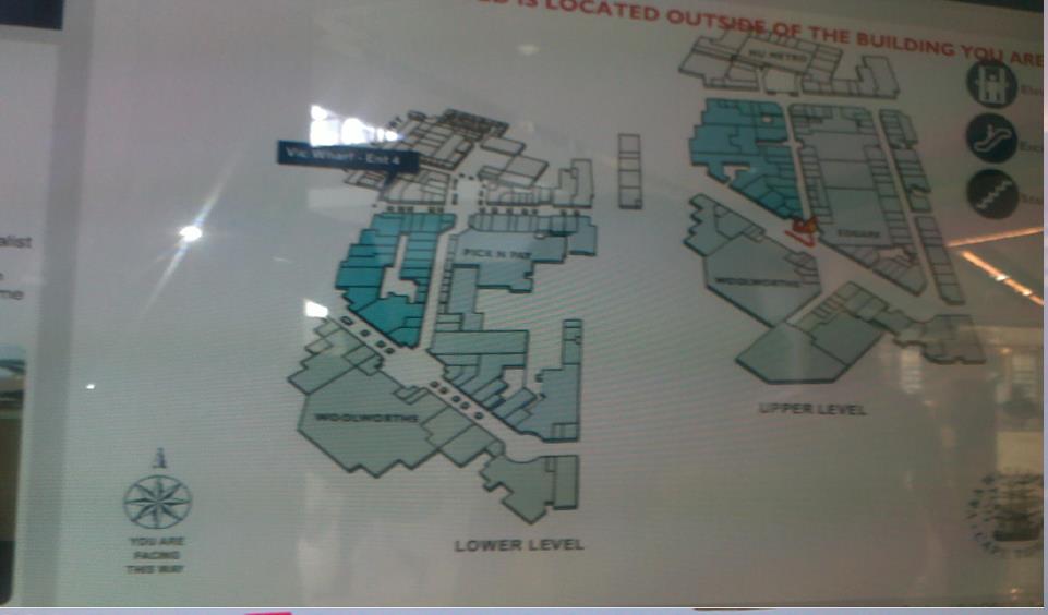
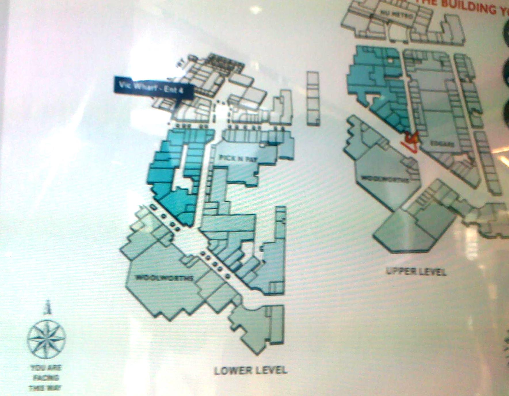
- Similar to the Cavendish mall in that floor layout is unclear. More so with the V&A in which both floors appear on the same level
- Heavy use of animations and transitions that confuse users
- Routes that are between both floors are disjoined and hard to understand
- Obscured speech bubbles
Other Malls
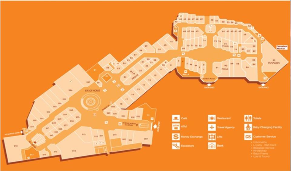
Wafi Mall – Dubai
- Much like the V&A paper map discussed, this is a similar implementation with a different color scheme. The color is jarring and less useful than simple white and shades of grey and black
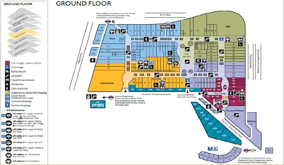
Westfield Mall – London
- The visualization displays floor layout well
- The colors however are largely unexplained in the key, despite one which highlights a luxury shopping area the others seem pointless
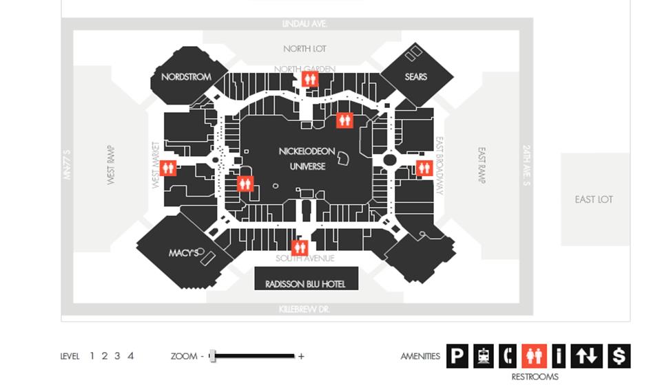
Mall of America
- This interactive map uses distinct colors well to show key locations on the map
- Brightly highlights stores when they are queried
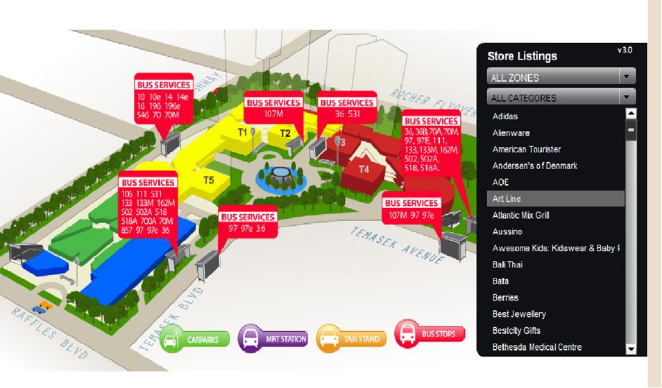
Suntec Mall – Singapore
- Colour differentiates sections of the mall well
- Location of store is a general idea and not detailed enough to actually find the store if needed
- Red on white colour scheme is not clear
Visual Queries
The following are visual queries that our visualisation aims to support. These are ranked from most important to least important
- How do I get from where I am to my desired destination?
- What key landmarks/stores will I pass by on my way to the destination?
- What route should I take if I'm disabled?
- What does the place I'm going to look like?
- How long will it take to get there?
- How far is the place I'm going to from where I am?
- Is the place I want to go to open?
- Where am I?
- Where am I facing?
- What floor level is my destination on?
Design Description

The overall goal of our design is to make finding the directions to the desired destination as simple as possible. The inspiration for our design is based on our observations that people tended to fair better with visual description of directions as opposed to visual ones. As a result, we decided to make the visual map as close to what verbal instructions would look like. This would mean removing a lot of the excess information that current information kiosks provide. The main advantage of this is that it would reduce the cognitive load on the user which in turn will aid the retention of the directions.
Initial
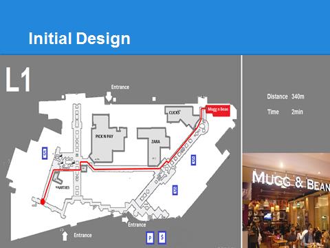
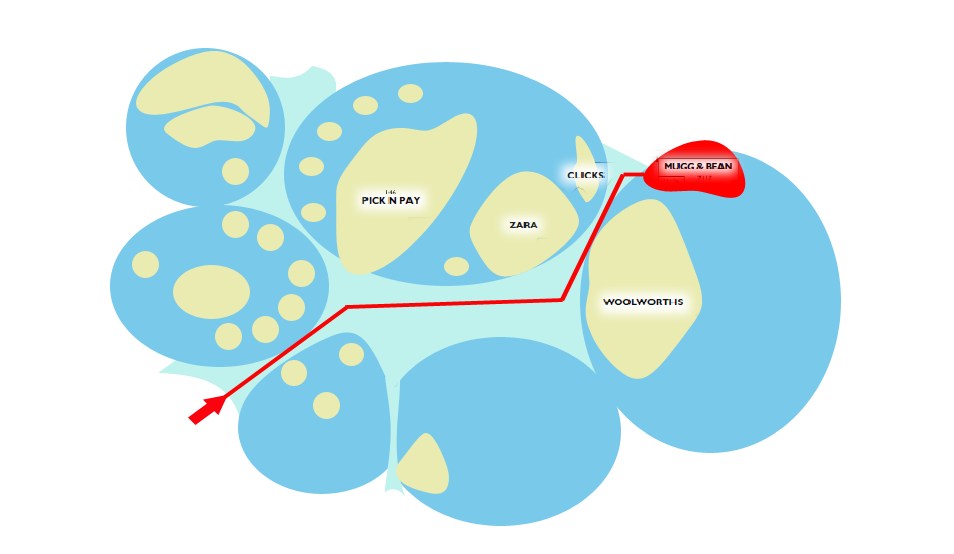
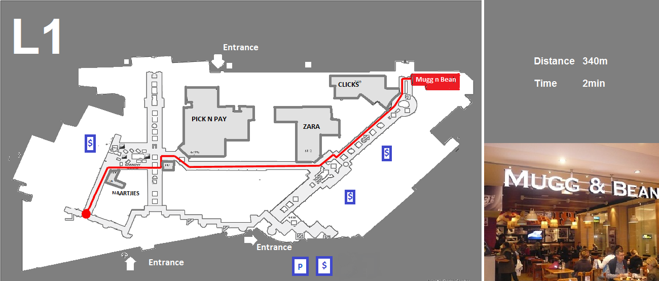
In our initial design, the main aim was to make the design as simple as possible. To this end we decided to remove the outlines of the other stores and leave only a select number of stores that would be found along the route from source to destination. This was inspired by how people give verbal directions. When verbal directions are being given, usually the turns that a person should take are provided and also a few landmarks along the route. This is why in our design; we decided to highlight specific stores that an individual would pass along their way. This will function as a means to aid them in their memory of the directions and also to confirm that they are travelling on the right route
We highlighted the route that a user would take in red. The reason for choosing to make the path red is that with the grey background, red is distinct and easily recognisable. We then made use of motion along the path. We used a red dot to continuously travel down the route. The aim of this was to increase the memorability of the route as the person would have that path continuously traced in their mind. Careful consideration was taken in determining the appropriate rate for the motion. Too much motion can be distracting which would take from the simplicity of the visualization.
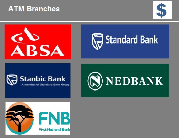
Blue icons were used in the design to facilitate for a quick answering of the major queries that would be made of the system. For example, queries like where to find ATMs are ones that would be very common in a mall. We included information that would provide an estimation of the distance and the time it would take to reach the required destination. This would better answer the visual query of how far away the destination is from the user’s current position. The image that we included on the side of the map works to aid in the memorability of the place. The user will be better able to quickly recognize the place when they get there.
Final Design
In our final design we attempted to implement more of the visualization techniques that we have learnt throughout the course and also to incorporate the improvement suggestions that we received from our initial design presentation. The following section highlights some of the visualization techniques that we implemented and their intended benefits to the design. We attempted as far as possible to keep to our initial strategy to keep the design as simple and as close to verbal-like directions as possible.
Colour
In our design we used 3 major colours namely grey, white and blue. This is in accordance with current teaching that recommends against having more than dominant colours on a plane. We also made use of colours that are of a unique hue to humans. Specifically the red, blue and white colours used; these are more simple for humans to identify and distinguish. On the map we made use of several techniques to achieve the effect of pop-out to highlight and emphasise on specific elements of our design.
The main colour used for the background of our design in grey. This colour was chosen specifically for its low saturation. This means that if people are to look at the screen for a long period of time, they will not end up straining their eyes. Also this allows us to have a higher luminance contrast when using different colours to highlight specific sections of the map.
The colour red was used to highlight the route from where the user is standing to their intended destination. It was also used to show the outline of the direction arrows used on the route. The colour red was chosen as it has a high luminance contrast with the dominant grey used in the design. This means that the user is able to quickly and easily distinguish this path from the other features on the map.
The colour blue was selected for use for the icons as it would enable them to be easily distinguished on the map. Also, as blue has a lower luminance contrast with grey as with the red-grey contrast, this ensured that the icons would not compete for attention with the highlighted red route, which is our main focus. By using blue only for the icons, this aids in learnability of the signs. As a result, when a person sees blue on the map, they automatically know that this is an icon. This helps in answering visual queries quickly, for example, one can easily get an overview of where all the restrooms are located.
The colour selected for the text on the map was white and this was chosen for two main reasons. The first reason was that the white colour provided a high luminance contrast with the grey background. This would make it easy to see and read. The second reason was that it makes use of the opponent theory in that it combines middle and long wave sensitive regions. Again this assists in making the text distinct and easier to identify and read on the map. The user will make use of cones differentiating between light and dark which makes it easier to distinguish the light text from the darker background.
Motion
The use of motion was one of the techniques we used to achieve the effect pop-out in order to emphasize aspects of our design. We used a zoom-in zoom-out effect in order to bring the users attention to their orientation in terms of the route that was drawn for them. This would quickly answer the visual query of where the individual was facing. The second use of motion in our design was to have a small arrow repeatedly trace the route in which the user would have to take to reach their desired destination. Upon the recommendations from the first presentation, we changed the circle to an arrow for tracing the path. This brought about the benefit of aiding the user in knowing which direction to take. So unlike the circle, when using the arrow it is easy to notice that at this intersection I should turn left because the arrow is always pointing in the direction in which the user should be facing.
The two advantages of using motion were that first, it aids the memory by helping the user to more easily store the route in memory as opposed to when viewing a static line. The second advantage is that as the arrow repeatedly moves across the path, it becomes a pattern and this helps people gain the gist of the direction they should be taking.
Emphasis
After removing all the excess details about the stores on the map, we emphasized a select number of stored by highlighting their shape. We used a thick grey border colour to emphasize the shape of each store. This helps the users in quickly getting the general idea of the location of each store that they will pass along the way.
Shape
In this design we made use of shape to assist us in distinguishing certain elements on the map on more than one channel. The main example of this is in the icons we used. The first channel in which the icons are distinct is with respect to colour. Then second channel in which they are distinct is with regards to shape as each icon has a shape unique to what it represents.
We made use of red arrow shapes to make the path to the destination easier to recognize. We also used squares to highlight text-boxes that we wanted to draw the user’s attention to.
Symbols
Symbols are very useful tools in design because if used correctly people are able to draw a lot of meaning from them. In our final design we selected symbols that we thought cater to the most frequent and general queries that would be made of the map. For example the icons for restrooms, ATM machines and food courts represent the majority of the most frequent queries made in malls. Also as most of these symbols are universal, people already have a meaning attached to them which make them easy to recognize and understand. The icons are divergent on two channels, colour and shape which make them much easier to be recognises.
On the recommendations made during the initial design presentation, we decided to replace some of the text with store names to the icons commonly associated with them. This aids in quick identification of the store as opposed to reading text which takes time.
Image of store
In our design we decided to place an image of the final destination to aid the users in quickly identifying the store they were looking for. People tend to draw a lot of meaning from images as opposed to text. So for example in this map, people will be able to draw more meaning from this image that just reading the text saying what the destination will be. From the image people are able to determine what the store front looks like making it easier for them to identify it when they reach it.
Two level Floor Map

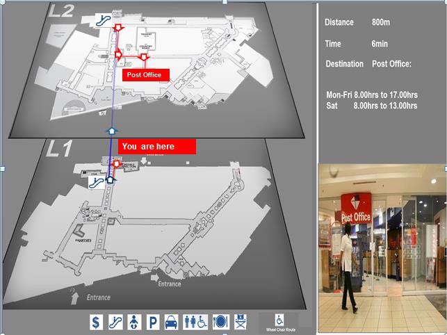
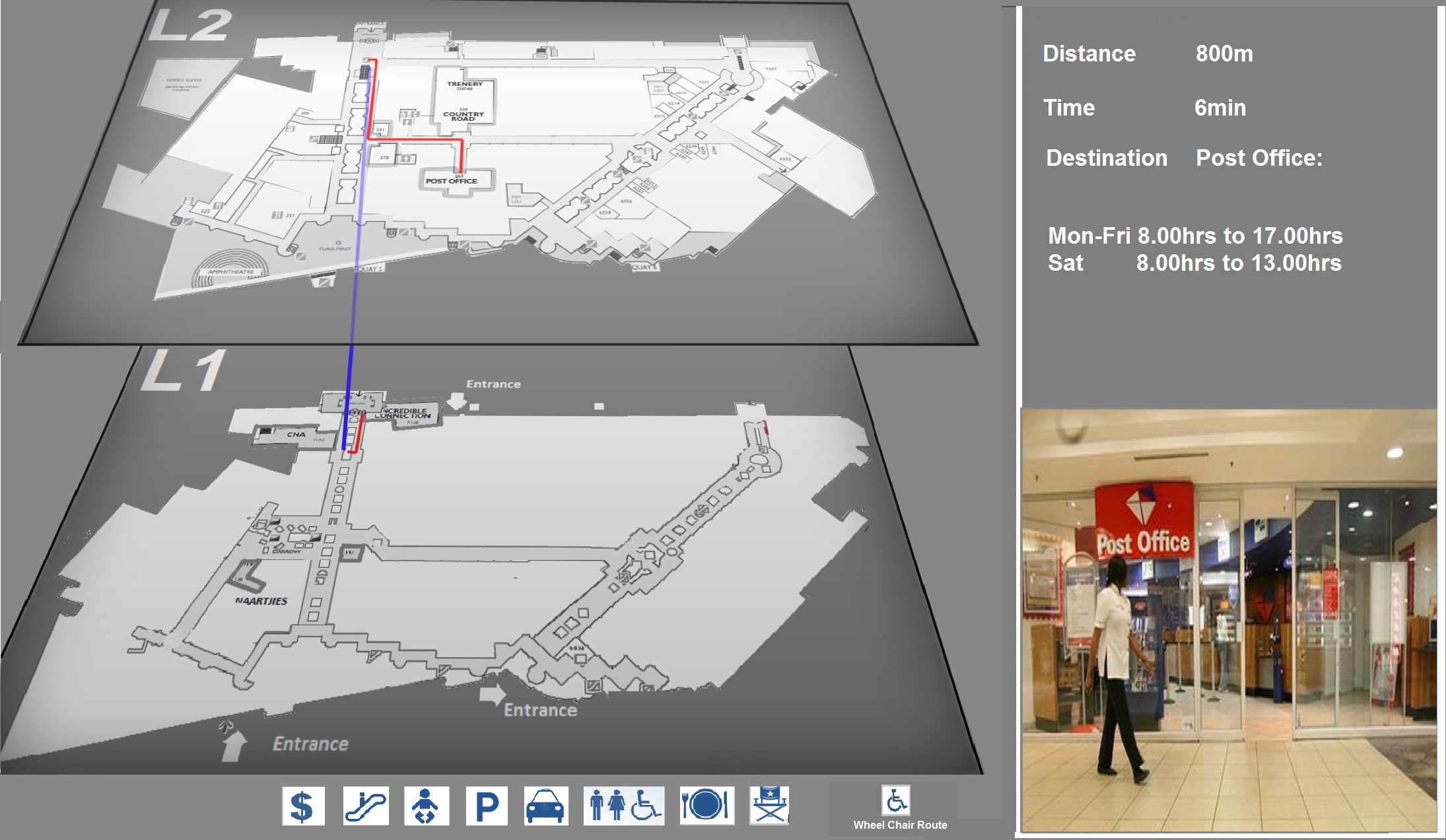
One of the challenges we found in the Waterfront and Claremont mall visualizations was how the route between two floors were displayed. In both systems, the maps of the different floors, for example floor 1 and floor 2 were placed parallel to each other. Then during the visualisation of the desired route a red line would start from one map and then appear on the other map. This was very ineffective as visualization because it was very confusing to the users. We addressed this problem by redesigning how the two maps were oriented on the screen. In our design we placed one map on top of the other which was easier for the user to understand as it is more intuitive. As humans it would be easier for us to understand representations of two floors with one on top of the other as opposed to parallel maps because in reality they are stacked one on top of the other.
The second method we used to our visualization of the route between two different floors was to make use of motion. First we kept the similar motion we used when displaying a route on one floor. To show that a user would need to go up or down one floor we made use of a blue line with arrows to show whether the individual would need to go upstairs or downstairs. This is easier for users to understand that the current system at Cavendish or Waterfront.
Changes based on initial presentation feedback
- Show where the person using the map is facing
- Included a direction arrow, including text to inform the user directly of their orientation in terms of the directions provided on the map
- Add more symbols to the map
- Added extra symbols. These symbols were selected to try and cater to the anticipated major queries that would be made
- Use arrow on the route instead of circle for better direction
- The circle from the initial design was replaced with an arrow
- Use store name icons for highlighted stores on route
- For the major stores with icons that are familiar to the majority of the population
- Include optional routes for disabled people
- We have included an icon to facilitate queries for routes that allow for wheel chair access
- Colour coordinate mall zones ( needs mall cooperation)
- This was implemented on the paper map by differentiating the different sections by colour and following the concept to creating streets.
- Think about how the physical map would look
- Improved upon the existing paper map
Strengths and Weaknesses
Another major strength of our design in that it answers quickly caters to several visual queries. It caters to more visual queries than the kiosks at Cavendish and Waterfront cater for. Some of these visual queries include catering for a wheelchair only access route, providing a rough estimate of the distance from their current position to the destination, providing an image of the front of the store, and providing readily accessible icons to cater for quick queries. Adding to the strength of our design is that it uses motion in a more effective way that the existing implementation at the malls we visited.
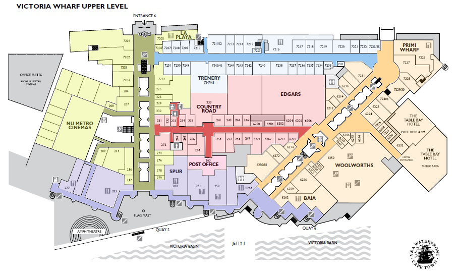
One of the aspects of our project was to improve upon the existing paper map. This current map was very dull and made very minimal use of colour. This made it difficult to use and difficult to answer basic visual queries to this.
We faced a lot of challenges in determining how to improve on the current design. What we wanted to do was to find a way to remove the numerous store numbers as a means of identifying each store. We hoped to find a simpler and less demanding way of getting this information. It was very difficult to find an alternative to this due to the space constraints on the map. When we realised that we would be unable to remove the numbering, we then thought of ways of improving the map whilst still using the numbers. This led to our design of using streets as a means of grouping information. The benefit of this is that it makes it easier for users to remember the general location of the desired store and it also makes it easier to find the particular store when using colour. One weakness of our design is that the icons on the paper map could possibly be improved upon. At present their colour is slightly affected by the background colour of each section. As a result it reduces the uniformity of all the icons and their visibility as some sections make them easily visible while others do not.
Paper Based Map
Motivation
In our first presentation it was suggested we implement a paper based approach to mall maps. Something that shoppers can carry, that uses visual cues to present data in an effective and engaging manner.
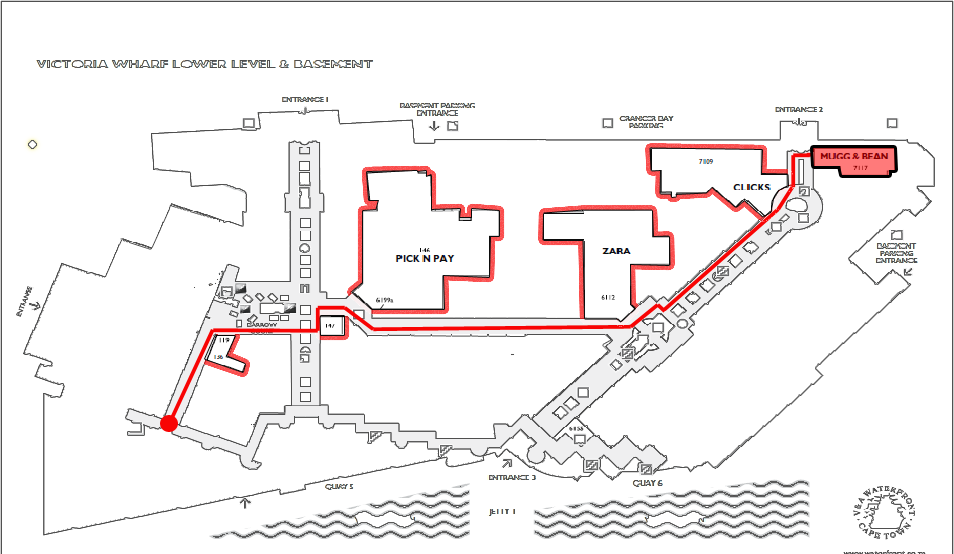
Using an existing paper based mall map for the V&A and numerous similar paper and interactive mall maps a new visualization was devised that borrows from existing visualization techniques.
Existing Visualization

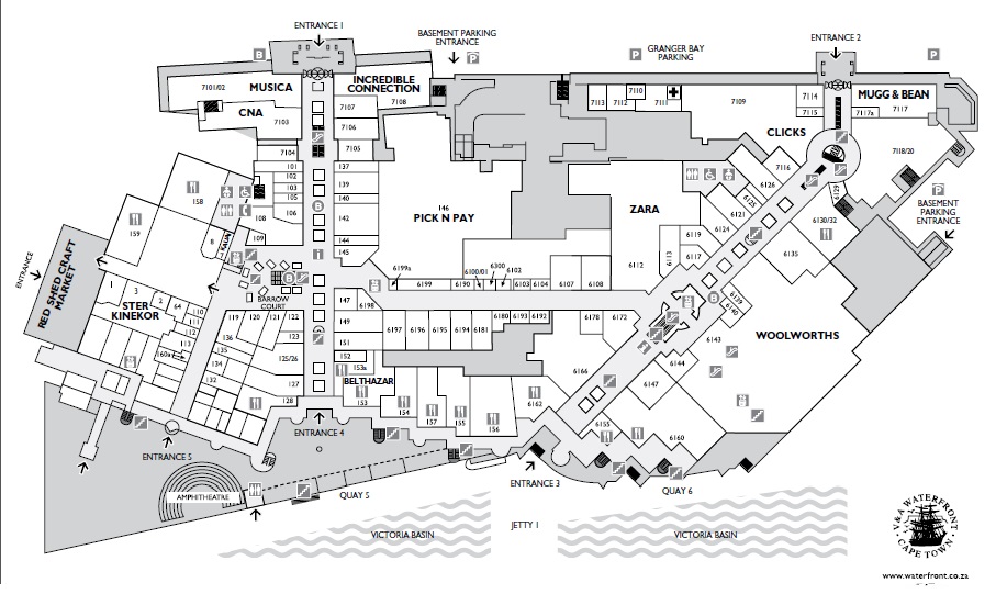
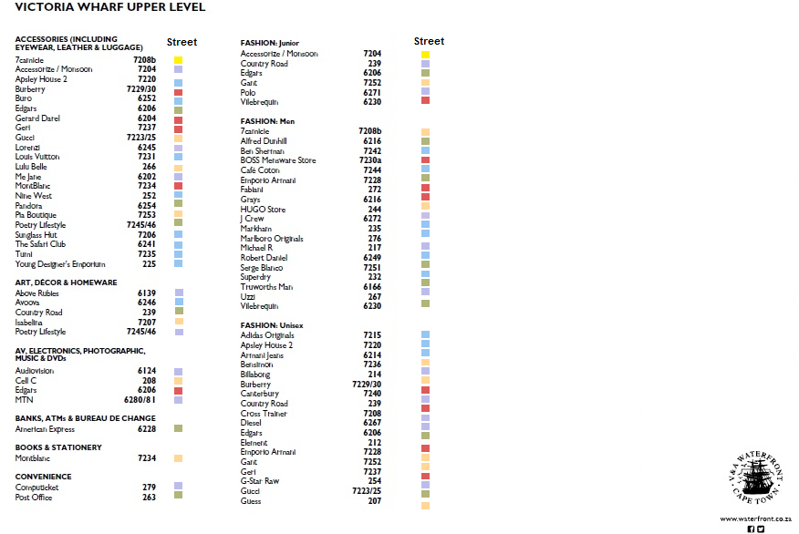
The original map has little use of visual cues. Use of color is kept minimal with white to depict stores and 2 shades of grey to separate corridors and storage areas. Effectively only the white shop areas and grey corridor areas are of relevance to shoppers, however there are no visual cues to effectively communicate this information.
Properties
The use of icons - The icons used were common and recognizable making them useful without a key. The colors of the icons are also too similar to the background they are placed making them blend in, and essentially making it more likely that shoppers will get confused when they find artifacts( escalators for example) where they had seen none on the map.
Addressing of stores – The vague and long store addresses make it more difficult for shoppers to remember.
Concept
The paper based visualization serves to guide users through the mall more conveniently than having to use an Information Kiosk in that they carry their guide.
Based on geography and streets – in order to differentiate different stores within the mall numerous aspects can be considered, store function, store size or location. We chose to use location as this comes most natural to using an actual map. In order to express this concept we chose to create a series of streets and expressing these streets using the color visual channel. Color is the most appropriate as it is already used in numerous mall maps, however not to this effect. Using color streets within the mall are easily differentiable.
A second visual channel was implemented to further differentiate streets. Shapes were used as a second visual channel to promote easier queries on data
Colors used were based on the colors used in numerous other color schemes in mall maps. The colors chosen were subtle so as not to strain eyesight whilst still being significantly different so as to avoid ambiguity.
In order to express what stores belong to a certain street a subtle fade of the street color was applied to all the stores with entrances within that street. This way it is immediately clear which street a store belongs.
Strengths
- Use of color adds a means of telling apart segments of the store helping users to immediately focus their attention.
- The concept of segmenting data was important with regard to the kind of visual queries shoppers would make. The existing visualization presented a lot of data but little or no means of effectively going through that data with as little difficulty for busy shoppers as possible.
- In order to facilitate quick visual queries we chose to look at the mall map as a road map. The two have clear similarity in that they are maps, however road maps or road systems are a concept that is well known much like using symbols that are well known and the mall map visualization could profit from this.
- We chose to use a color scheme to explicitly declare roads (named after their colors). Coupled with the color tag in the shop list, the result is an immediately intuitive road and addressing system familiar shoppers.
- Color fade makes it immediate apparent which store lies on which street
- To further emphasize addresses, a color bleed was applied to stores belonging to a street helping to further segment data clearly (what store lies on what street). Finally street colors were selected and placed in such a way that there was a stark difference between connecting streets to avoid confusion.
Weaknesses
- Further visual channels could be explored to make differences more apparent
- At the time of presentation despite the use of color nothing else was done to improve visualization
- Addressing of stores
- While not a weakness we struggled with changing the existing store addresses to street local addresses for example store 7702 could be store 30 on blue street. One argument was that the existing solution worked to reduce confusion while another would suggest that in fact the existing solution was cumbersome and instead the suggested solution would reduce confusion at least as much.
Improvements
In order to improve on these weaknesses we suggested the following changes after the presentation.
Addressing local to the street was implemented
- Local Addressing is synonymous with the road map theme, enhancing its
- Shorter addresses are easier to remember
- Shorter addressing means addresses are larger and bolder shapes unique to each street were implemented
- Shapes help differentiate streets and colors particularly in the shop list
Shapes unique to each street were implemented

|
Conclusions and Future Work
In conclusion, this has been a very enjoyable and worthwhile project for us. It is our hope that information kiosks in malls can have better designs as this would definitely save people a lot of time and add to their experience of the particular mall.
References
Visualisation sources
Westfield - London
Westefield Mall
Wafi mall - Dubai
Wafi Mapp
Suntec Mall - Singapore
Suntec Mall
Mall of America
Mall of America
